Here’s a simple interior decor tip to use.
It’s simple, yet it has a major impact at the same time.
In fact, if you neglect it, you can use all other complicated decor tips that anyone else will give you and still not end up with what you want!
It is an insider secret which interior designers use, and is not often taught.
So what is it?
It is that the color of the major decorative item that you add or the focal point of the room, should complement the rest of the room.
How does this work?
The secret is in color temperature relationships.
See the majority of your room is often composed of one color scheme or color group.
For example, let’s take the most common or popular, which is beige:
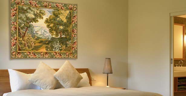
Let’s take a look for example, at this room which is composed of creams, browns, beiges and whites.
The example above is of a bedroom, however, the same can be applied to your living room, home office or dining room.
When you choose a large item of decoration, or a focal point of interest, such as a work of art, choose a piece that complements the general decor.
This does not mean it has to be the same color or match.
It just has to complement.
This is the difference.
So how do we figure out quickly and easily, what will compliment well?
We can use color temperature relationships.
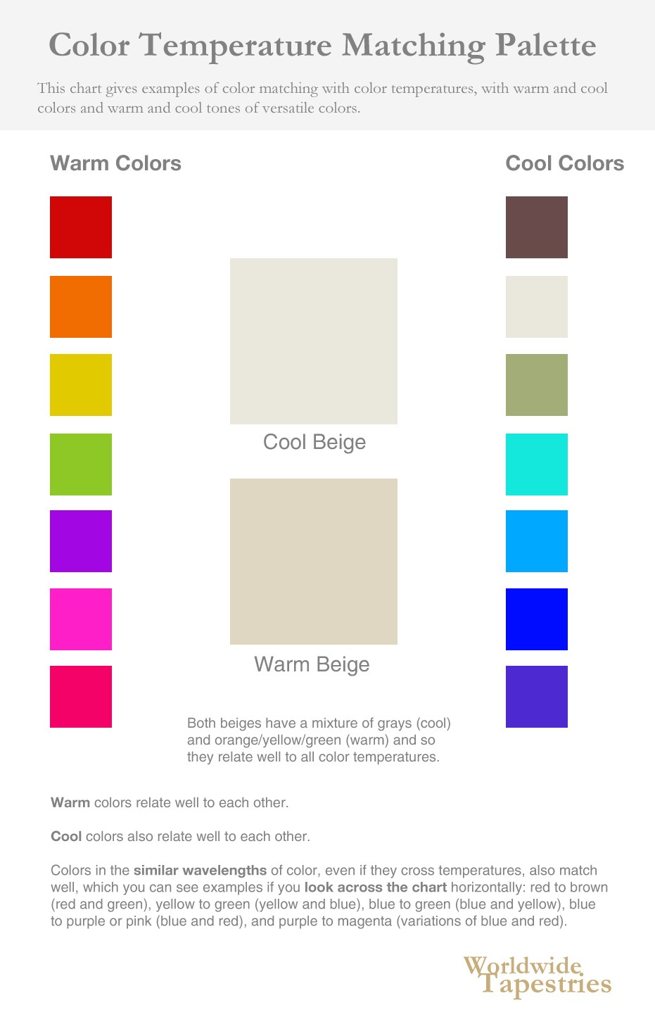
Colors can be warm colors, or cool colors.
And some colors such as beige, which is composed of warm and cool elements, can compliment both cool and warm colors.
Have a look at this chart.
So for example, in the wall art:
We see that the colors of the tapestry is mainly warm colors: yellow greens, yellow oranges, browns, pink. There is some blues, however it is mot the majority of the piece.
So we now we need to do a 3 point check.
How to do it?
Here’s how.
1.
Does the colors of the piece compliment each other?
The colors of the art complements each other well.
Why?
They are warm colors.
So there is internal complimenting going on, within the piece, with the exception of the blue sky and clouds.
2.
Does the colors of the piece compliment the wall color?
The wall color is beige, which has elements of warmth and coolness, so in this case, it is easy.
The color of the wall (warm and cool, more towards the warm, as it is a yellow green beige) compliments the artwork (warm).
3.
Does the colors of the piece compliment the other decor in the room?
The decor is mainly warm colors, so yes the decor and the art piece compliment well.
So that is how you do it.
On first glance, you will notice how the tapestry above has all these colors that go beautifully with the theme of beige.
There is a science behind why colors complement and looks good together. However this doesn’t matter!
What matters as the ultimate test, is that it looks good to you.
What you can do is to put the beige and the ‘x’ color together in your mind, and then you will feel whether they go well together or not.
As a method to use in your mind is the method shown in the chart above to make it easy, and to apply a method to it.
Simple right?
So now you know the steps interior designers use to put the colors together and see if they complement each other.
So there you go.
You now have a simple, and simple to use decor tip that you can apply to any new decor you are about to add into a room.
So put it to use, and experience the results for yourself!