Color has a great affect on our psyche. It is a major factor when decorating a home. Whether one room, or an entire house, the significant use of color makes an impact on how we feel.
Most of us spend more time in our homes than anywhere else.
Our moods and sense of well being are directly influenced by our surroundings.
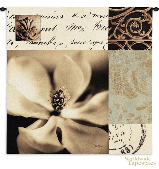
So we should be aware of how we use color in our home. A major way to add color into your home is through art tapestries in a large variety of styles.
Plus below you can see the color chart of color trends for 2016.
How do you do it?
For tapestries, see this page for the wall tapestry art that are the latest in tapestry designs as well as the best selling tapestries here.
Let’s take a look at the best ways to use color to enhance the feel and texture of your home.
Tip 1
Choose colors that accurately reflect the statement you wish to convey about your home.
In other words, if you are looking at a traditional style you may want to use terra cotta, or beige, or neutral muted tones contained in stone. These tones are capable of complimenting bold as well as neutral colors.
For themes coinciding with nature, you might use lavenders, or subtle green shades. These go well with green, blue, purple as well as the brighter crimson and pink.
If you want a modern decor, or when refurbishing a character home and want to modernise it, choose a “gray beige” such as Pebble Bay (Taubmanns), because “yellow beiges” are older in style.
“Grey beiges” are modern, yet not sterile like pure greys are.

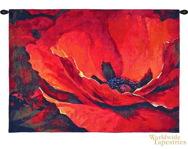
When you want to use robust color as wall color, you would do well with warm to hot shades like the reds, golds, and deep rose tones. Remember that the alternative to bold walls, is to have neutral walls and add color via wall art.
See this color chart here:

Tip 2
Follow the 60:30:10 rule.
Usually there is a general color theme throughout the house. However should you decide to highlight a specific area, such as a wall. Make sure that the highlighted area represents approximately 30% of the room.
Then by using 10% as accent in deeper tones or as furniture you will attain a proportion that will be aesthetically pleasing to the eye.
Higher proportions tend to look more unbalanced and even overbearing.
Tip 3
When your wall decor is understated, it is more effective to color the walls with lighter shades.
For example, if you have paler shades of color in your decor, it can look washed out and dominated by bright colored walls.
If you have lighter, more neutral walls, then the delicate colored decor will look in place.
Using wall decor as an accent, with bright colors, you can use either bold or subtle wall color.
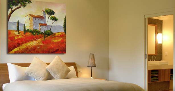
Here’s an example of bold use of wall color with decor:

For a color infusion into your home, see this range of art genres of tapestries including fine art, Renaissance, Impressionism, modern or contemporary art.
Tip 4
Trust your feelings when decorating, they are invaluable.
Check these simple rules when selecting decor whether it be wall art, ornaments, furniture, vases, flowers or any other unique decor:
a.
Does the theme fit into the function of the room?
For example, if you have a romantic or sensuous piece, this will go well in the bedroom, and may not be the best in the lounge room.
If you have a landscape scene, then this may be suitable for most rooms, such as a lounge, home office, hallway, though it may be not sensuous enough for a bedroom.
If you have a home office, then landscapes and world map tapestries provide a wonderful look and feel.
b.
Does the theme fit into the style of the room?
If you have traditional architecture with limestone walls, exposed beams etc, then a medieval or romantic era theme may fit most.
If you have a nautical theme for your kitchen and living area, then nautical decor may be in order.
If you have a modern living area with a lot of glass and metal, then modern themes can work. You can create an interesting effect with a classical or romantic era piece to bring a warmth and a completely different feel to the room.
c.
Do the colors compliment the rest of the room?
For example, do the colors look good together? Too little variety and it will feel not very uplifting. Too much variety and it will look much mish-mash of color, and will look too unsettling.
d.
How does the decor make you feel?
For example, is the subject matter or color too sterile for the room?
Is the subject matter or color too stimulating for that room (less likely to occur than the too sterile!) of for your style.
This is where you trust your feelings.
Tip 5
It is important that you are aware of and correctly use color temperatures.
What is color temperature?
Cool colors are the blues, greens, grays and cooler shades of purples.
Also there are cooler shades of color, such as cooler beiges (more gray, less yellow).
Warm colors are the yellows, oranges, reds, pinks, warmer shades of purples.
And then you have the warmer shade of color such as the warmer beiges (more yellow or orange).
The general secret to color temperature is that cooler colors go well together, and warmer colors go well together.
Although, there are general rules to follow, keep in mind that exceptions can sometimes make for an interesting and unique combination.
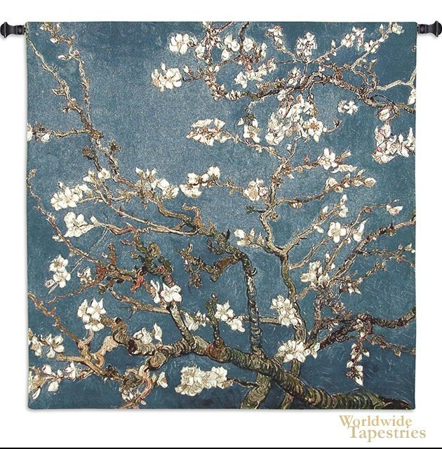
For example, a floral theme such as the Almond Blossoms above, fits both modern and traditional themes, as impressionistic art is on the cusp of both traditional and modern.
The cooler colors of blue suits cooler colors such as lavender, as well as gray beiges.
However the warmer browns and peaches in the piece, being a much smaller surface area, also makes it suitable for warmer color tones as well such as a warm beige or even a fuschia.
To summarize…
So, while you follow the suggestions made here, always have your mind open for new and exciting possibilities.
If in doubt, play around with it til you find a great effect that lifts you up.
Make sure you see the big picture of the overall theme of the room and home, while allowing your personality and gut instinct to guide you as well.
So use these 5 tips using color in your home, and you will create wonderful results that you may enjoy for years to come, and with which will provide a superb effect for your family and all visitors.
You can reap the rewards that you own distinct talents can bring you when using these simple and easy tips, including when choosing your favorite tapestries.
Now you will be able to achieve decorating your home exactly as you dreamed it.


2 thoughts on “5 Insider Secrets to Use Color In Home Decoration”
I am thinking about buying this tapestry (Orange colors with 2 flowers, green stems)Tulipe Red tapestry. I did my kitchen in these colors: burgandy wine, sunset orange and white. What is the cost for this tapestry? I may also need a white or black tapestry hanger. Thanks. Mrs. J Meier
Hi Jamie,
You can purchase floral tapestries at:
https://www.worldwidetapestries.com/category/floral-tapestries/
We also have a selection of tapestry rods at:
https://www.worldwidetapestries.com/category/tapestry-rods/
to choose a rod that will be a good match.
Worldwide Tapestries